This website uses cookies so that we can provide you with the best user experience possible. Cookie information is stored in your browser and performs functions such as recognising you when you return to our website and helping our team to understand which sections of the website you find most interesting and useful.
Found 786 results.
- Why KovaionAI is the Ultimate CRM Solution for 2025
- Setup and Usage of the Pipeline Requisition
- Transforming Talent Acquisition with Oracle Recruiting Booster
- PeopleSoft Payable Time Dashboards – Revolutionizing Time and Labor Analytics
- Embedding Insights in Fluid Workcenter in PeopleSoft 8.61
- How KovaionAI Automates IT Support with Intelligent Service Management
- Managing Remote Work Eligibility at Job Code and Position Level
- Rapid Calculation in Global Payroll – PeopleSoft HCM Image 51
- Webinar | Simplified Claim Management Using AI Agents
- PeopleSoft Supply Chain Management – All You Need to Know
- Unlocking PeopleSoft Reporting: Essential Tools & Strategies
- Pros and Cons of PeopleSoft – A Balanced Overview
- How KovaionAI Integrates Digital Signature Features for Effortless Transactions
- Oracle HCM Cloud Goal and Performance Management
- Oracle Integration Cloud Consultant
- Oracle HCM Cloud Mobile App – Comprehensive Guide
- Oracle HCM Cloud Security
- Moving from PeopleSoft to Oracle Cloud HCM? The Business Case Explained
- Top 10 Features of KovaionAI’s Knowledge Base Tool for Business
- Oracle Business Development Manager
- Top Reasons Why KovaionAI is the Best Low-Code Platform for Automation
- 10 Ways a Workflow Management System Can Accelerate Your Business Growth in 2025
- Maximizing Customer Insights with KovaionAI’s AI-Powered CRM Solutions
- Oracle HCM Cloud Profile Management – Features, Benefits, and Best Practices
- Top 12 Customer Support Desk Software Every Startup Needs in 2025
- Time Reporters Waiving Meal Breaks – PeopleSoft HCM Update Image 50
- PeopleSoft PeopleTools 8.61 New Features Overview
- Oracle Extends Premier Support for PeopleSoft Through 2036
- 10 Key Features to Look for in an Enterprise-Grade Low-Code Platform
- The 20 Best Help Desk Software in 2025
- Kovaion Offers Oracle Cloud Success Navigator – Service
- Building Mobile-First Applications with KovaionAI’s Cross-Platform Framework
- Building Real-Time Analytics Dashboards with KovaionAI in Under a Day
- Newsletter – March 2025
- U.S Wages Statement Tax Data Section Update – PeopleSoft HCM Update Image 51
- Enhancing ePerformance with Instructions at Step level and Section Level
- PeopleSoft FSCM Update Image 52 – Simplifying Workflows with Enterprise Service Automation Features
- End-to-End Testing Strategies for KovaionAI-Built Applications
- How KovaionAI’s API Gateway Enables Seamless Third-Party Integration
- Webinar – Embedding Insights in Fluid Workcenter’s in PeopleSoft
- Delivering Timely Updates and Opportunities with HCM Communicate
- How KovaionAI Enables Agile Methodology in Enterprise Software Development
- The Technical Foundation Behind KovaionAI’s Enterprise-Grade Security
- Managing Supplier Profile Change Requests in Oracle Fusion
- Webinar | Empower Your Business with AI-Driven Solutions from Kovaion AI
- Newsletter – February 2025
- Accounts Executive
- Webinar on Travel Authorization and Expense Management – PeopleSoft FSCM PUM 50
- Webinar – Employee Joining Dashboard in Peoplesoft Fluid
- Low Code for Small Business
- Oracle HCM Cloud Consultant
- Webinar | Design Your Custom Application with Powerful Kovaion AI Platform
- Webinar | Create a Cutting-Edge eCommerce Management Application
- Webinar – Streamlining HR with E-Signatures & Redwood Journeys in Oracle HCM
- Newsletter – January 2025
- Oracle SCM Cloud Consultant
- Customer Success Manager/Solution Architect
- Low Code for MobileApps
- Marketing Intern
- Low Code for Startups
- Boost Your Cloud with Kovaion’s Oracle Cloud Infrastructure (OCI) Services
- Craft an Expense Management Application in Less than 30 Minutes
- Webinar – Key Enhancements in “Performance Management”
- Modern Solutions for Retail and Wholesale
- Enhanced Learning Recommendations: Audience Selection & Streamlined Workflow – Quickread
- Workforce Modeling – Predict, Plan, and Optimise with Oracle HCM – Webinar
- Oracle Cloud Infrastructure (OCI) Services
- Oracle DBA Services
- Digital Transformation Services and Solutions
- Oracle Peoplesoft
- Newsletter – December 2024
- Webinar | Automate Employee Management in Just 30 Minutes
- Oracle HCM Cloud Payroll Consultant
- Head of Strategic Sales
- Oracle Business Development Manager – UK
- Unlocking the Power of Oracle HCM Help Desk
- Page Customization with Oracle HCM Fusion Visual Builder Tool
- Webinar | GENAI-Powered App Builder Platform Capabilities
- Webinar: How to Create Help Desk Management Software using KovaionAI
- Quality Engineering Lead
- PeopleSoft Campus Solution Consultant
- PeopleSoft India SIG 2025 – Oracle Partner – Kovaion
- Newsletter – November 2024
- Oracle HCM Communicate with 24B update – Mastering Targeted Communications
- Oracle Fusion HCM Reporting & Analytics Developer
- Webinar | Key Takeaways from the Bengaluru Tech Summit (BTS) Event
- Creating an HDL File through OIC Integration | Quickreads
- Diwali Celebration 2024
- Webinar on Oracle Grow | Empowering Employee Development and Internal Mobility
- Webinar | Exciting Features to be Unveiled for Kovaion App Builder at BTS Event
- Head of People & Culture
- Product Manager
- Newsletter – October 2024
- Webinar | Advanced Workflow Automation using Kovaion App Builder Platform
- Webinar | Key Highlights of ‘PeopleTools 8.61 – Security’
- Newsletter – September 2024
- Oracle Redwood Implementation
- Oracle ERP Cloud | Asset Management | QuickRead
- Custom API Development using App Builder Platform | Low-Code Platform Webinar
- Technical Product Manager for App Builder Platform
- Customizing Applications with Redwood Visual Builder
- Team Management with Oracle Redwood Experience: The Team Activity Center
- Onam Celebration-2024
- Kovai MarathON – 2nd Edition
- Webinar on Talent and Succession Plan in PeopleSoft
- Junior Oracle HCM Cloud Consultant
- PeopleSoft Administrator
- Newsletter – August 2024
- The Power of Redwood & GenAI in Oracle HCM Cloud | Webinar
- Unlocking Enterprise Potential | Leveraging LLMs with RAG and Vector Databases | Webinar
- Newsletter – July 2024
- Webinar | PeopleSoft HCM PUM 49 | Configured Time Summary in Fluid Timesheet
- Webinar | Why You Need an Enterprise Knowledge Management Platform
- Music Day Celebration
- Blood Donation Day
- Kovai Marathon’s – Family Run
- PeopleSoft Campus Solution Consultant Job Opening | Kovaion
- Junior Oracle DBA
- Women’s Day Celebration
- Republic Day Celebration
- Pongal Celebration
- New Year Celebration
- Revolutionizing HR with GenAI | In-Person Event at Oracle Tech Hub
- Newsletter – June 2024
- Webinar | Highlights of PeopleSoft HCM PUM 49 | Recruiting Enhancements & Insights Dashboard for PFC
- Webinar | Business Process Automation Using Low-Code Platform
- Project Manager
- Small Business App Development Platform | Low-Code/No-Code
- Newsletter – May 2024
- Webinar | PeopleSoft HCM PUM 48 | Fluid Leave Donation
- Business Development Lead
- Webinar | Creating a reliable app builder platform using AWS EKS
- App Builder
- Newsletter – April 2024
- Oracle Fusion Cloud HCM | Generative AI Feature | Performance Review
- Oracle HCM Cloud | How to Add a Location to Manage Calendar Event
- Customer Success Manager
- Webinar | Key Highlights of Oracle CloudWorld Tour 2024
- Webinar | Gen AI Use Cases in App Builder Platform
- Newsletter – March 2024
- Delving into the Highlights of PeopleSoft India SIG 2024
- Oracle Integration Cloud | Conditional Loops
- Oracle HCM Cloud | Display Scrolling Text in the Dashboard
- Oracle HCM Cloud | Touchpoints
- Low code for Insurance
- PeopleSoft India SIG 2024
- Bulk Learn Withdrawal | Oracle Learning Cloud Module | Oracle HCM Cloud
- Oracle CloudWorld Tour Mumbai – 2024
- Absence Application Page | Hide or Show the Save & Close feature
- Kovaion’s Biryani Feast and Welcome Kit
- Oracle Journeys | An Enhancer to Employee Care Package
- Creating and Configuring Customer details in Receivables
- AI/ML
- Oracle ERP Cloud
- Enabling Salary History Data in Employee Info | 23A Feature | Oracle HCM Cloud
- Low Code Platform
- Generation of QR Codes | Oracle BI Report
- Oracle Fusion Workforce Predictions
- Customizations on Learning Landing Page | Oracle Learning Cloud
- Oracle HCM Cloud
- Alternate Email for Employees during Job Application | ORC | QuickRead
- AP Payments Management | Oracle ERP Cloud | QuickReads
- Informative Power BI Enabled Dashboards | Immigration Practice Dashboard
- PeopleSoft Junior Associate
- Home
- Peoplesoft DBA
- Upcoming Events
- Data Archiving
- PeopleSoft
- How KovaionAI’s AI Engine Automates Complex Business Decision Processes
- Oracle Database Administrator
- Corporate Social Media Platform Using Kovaion’s Low-Code Solution
- Low-Code Platform for Manufacturing Industries
- Past Events
- Bangalore Office Opening
- PeopleSoft
- Data Masking
- Oracle HCM Cloud
- About Company
- Streamlining US Federal HR Personnel Actions – PeopleSoft HCM Update Image 50
- Alternative to Appian
- Alternative to Retool
- Manufacturing Workflow Simplified with AI App Builder
- AI-Powered App Builder for Retail Industry
- Alternative to Airtable
- Alternative to Thunkable
- Alternative to AppSheet
- Alternative to Outsystems
- Alternative to Power Apps
- Alternative to Mendix
- Alternative to Kissflow
- Enterprise App Development using Kovaion App Builder | Webinar
- Alternative to Pega
- Business Development Lead
- Onam Celebration
- Oracle HCM
- Document Management System
- Oracle ERP Cloud
- Leadership Team
- Peoplesoft HCM Update Image 30 – Raise Document Request for Students to Request Grade Cards
- Oracle HCM Associate Consultant
- Webinar | Build Your Apps Powered with Gen AI
- Alternative to Zoho Creator
- Kovai MarathON: Believe In Yourself
- Oracle ERP
- WhatsApp Intelligent Platform
- Oracle Taleo
- Culture
- Technical Overview: KovaionAI’s Data Transformation Pipeline
- Top Gun – Oracle DBA
- Oracle CloudWorld Tour Mumbai
- Independence Day Celebration
- Knowledge-Based Portal
- Taleo
- AI & ML Services
- Career
- PeopleSoft Enterprise CS Student Records Version 9.2 – Student Program Plan Overview
- PeopleSoft India SIG 2024
- PeopleSoft Techno Functional Consultant
- WhatsApp Marketing
- Mother’s Day Celebration
- HR Recruitment
- Data Analytics
- Contact Us
- Oracle Recruiting: Simplifying Candidate Communication and Bulk Messaging
- Webinar | PeopleSoft HCM PUM 47 | Notification Composer
- Junior Oracle HCM Cloud Consultant
- International Yoga Day
- Business Events
- Automation (RPA)
- Privacy Policy
- Create Survey Manager Experience with Oracle Core HR
- Webinar | Unveiling the latest features of 23D – Oracle HCM Cloud
- Senior Full Stack Developer
- Tamil New Year Celebration
- Application Development
- CSR
- General
- Oracle Cloud Success Navigator to Maximize Oracle Cloud Journey
- Webinar | Mastering Low-Code for Rapid Application Development
- Oracle ERP Cloud Implementation Lead
- Data Analytics
- Women’s Day Celebration
- Care for PeopleSoft
- Unlocking Innovation with Low-Code AI Platforms
- Quick Reads
- Webinar | Exploring Performance Management in HCM PUM 45/46
- Senior Business Development Executive
- Pre Pongal Celebration
- AI & ML
- Best 15 Benefits of AI in Banking
- Blog
- Webinar | Customize Apps in Retail Business | Your Idea Your App
- PeopleSoft Global Payroll Consultant
- Kovaion’s Christmas Day Celebration
- Oracle HCM Cloud Onboarding – Complete Guide
- Webinar | Oracle P2P: Significance in Business Operations & their Stages
- Peoplesoft Top Gun
- Kovaion Day | 14th Year
- Low Code App Development Platform
- Top 15 Advantages of AI in Business 2025
- Zero-Code App Builder
- Data to Dashboard: Low Code Integration & Analytics Brilliance | Webinar
- Men’s Day Celebration
- Oracle ERP Consultant
- Absence Management in Oracle HCM Cloud
- No-Code App Builder
- Webinar | Remote Worker & Lockdown Framework in PeopleSoft HCM Update Image 46
- Halloween Day Celebration
- Oracle HCM Senior Consultant
- Talent Management in Oracle HCM Cloud – Complete Guide
- Newsletter
- Webinar | PeopleSoft HCM Update Image 46 | PUM Highlights
- Diwali Celebration
- How KovaionAI’s Drag-and-Drop Interface Accelerates Enterprise App Development
- Oracle HCM Cloud
- App Development Made Easy: Achieve 5X Savings in Time & Cost | Webinar
- Independence Day Celebration
- Global Human Resources (HR) in Oracle HCM Cloud
- KovaionAI
- Oracle ME: Employee Engagement & Retention Made Easier | Webinar
- World’s Chocolate Day
- Oracle Strategic Workforce Planning – Complete Guide
- Simplify App Development with Low Code Platform | Webinar
- Coimbatore Office Opening
- AI-Powered Decision-Making Transforming Retail Operations
- Webinar | Self-Service Absence Management | PeopleSoft PUM Image 45
- 10 Benefits of Artificial Intelligence in Healthcare | KovaionAI
- Webinar | Enhancing Employee Learning using Oracle Learning Cloud
- 5 Ways KovaionAI is Revolutionizing Fintech Application Development
- Webinar | PeopleSoft PUM 43/44 | Exploring Self Service Functionalities
- 6 Mobile App Development Platforms with Advanced AI Capabilities
- Identify & Engage on Employee Attrition | Kovaion Biz Intelligent Tool
- PeopleSoft Asset Management – Complete Guide
- PeopleSoft India SIG 2023
- Best Oracle ERP Consulting Firms and Implementation Experts
- Modern Day Business Integration with Wootz
- PeopleSoft Enterprise Performance Management (EPM) – Comprehensive Overview
- Experience the excellence – Deploy PeopleSoft Chatbots
- Filter Action Reasons by User Roles on Redwood Pages
- Modern way of handling employee data – JOB data Modernization
- Streamlining Approval Rule Migration in Oracle Fusion HCM with SOA Composer
- Automate Data Masking with Oracle HCM Cloud Extensions
- 7 Cloud-Based Integration Platforms that Save Hours of Development Time
- Workplace Safety First – Track Incidents and Illness effectively using PeopleSoft
- Creating Multiple Templates in a Single RTF File
- Explore the new Functionalities of 21 A release of Oracle HCM Cloud
- How AI is Shaping the Future of Multi-Language Customer Support
- Digitally Engage with Employees to re-design the career strategy
- 5 Enterprise Solutions you can Build in Hours with KovaionAI Builder
- Experience the Modernizations delivered in 22A HCM Cloud
- How No-Code AI is Revolutionizing the Development Process
- Leverage the Next-Gen Solution to Find RIGHT TALENT – Oracle Recruiting Cloud
- How Generative AI is Transforming Software Testing: A Complete Guide
- Interlink of Oracle Time and Labor & Oracle Project Costing – ‘How’ and ‘Where’ of the data flow?
- Recalculate Rate Component and Salary Details Using Run Rates-based Salary Process – Oracle HCM Cloud
- A Holistic view of Teams’ availability – PeopleSoft Team Calendar (HCM PUM 42)
- Insights into Graphical Representation in Oracle Data Intelligence
- MODERNIZE your PeopleSoft and SAVE upto 38% with OCI
- Top 8 Data Visualization Platforms for Business Intelligence in 2025
- Oracle HCM Cloud Absence Management – “Value-Added” features to Offer in 22B/C
- Leverage the latest of PeopleSoft FSCM – PUM 43/44
- PeopleSoft Payroll: Ultimate Solution for Streamlined Payroll
- Digitalize the Workforce Appraisal
- PeopleSoft Customer Relationship Management (CRM) – Ultimate Guide
- Automate Employee Performance with Oracle HCM Cloud
- Top 10 AI-Powered CRM Solutions Reshaping Customer Experience
- Best Oracle HCM Cloud 22D Webinar | For Free
- PeopleSoft vs. Workday – A Comprehensive ERP Comparison
- Embarking on Journeys with HCM Cloud Checklist | Free Webinar
- The Beginner’s Guide to Choosing the Right Low-Code Platform
- Unlocking Autocomplete Rules in HCM Cloud
- Why Oracle Continues to Invest in PeopleSoft – Key Reasons Explained
- Engage your customers with Kovaion’s Intelligent WhatsApp Communication
- PeopleSoft Supply Chain Management – Expert Guide
- HRIS vs. HRMS vs. HCM: Key Differences Explained
- Optimizing Human Capital with PeopleSoft HCM Solutions
- Top 12 No-Code Website Builders that will Dominate the Market in 2025
- Top 9 Industries Benefiting from Low-Code App Builders
- Top 15 AI Tools in HR in 2025
- Top 15 AI Analytics Tools to Use in 2025
- Top 8 Workflow Automation Tools for Small Businesses in 2025
- Top 10 Ticketing Tools for Streamlining IT Support in 2025
- Employee Joining Dashboard – Navigation Collection
- Top 7 Low-Code Platforms for Building Enterprise-Grade Applications in 2025
- 10 Emerging No-Code Platforms to Watch in 2025 for Smarter App Development
- PeopleSoft Insights – Empowering Position Management with HCM PUM 48
- Oracle CloudWorld Tour 2025 – Mumbai: A Glimpse into the Future of AI & Cloud
- AI Meets Customer Engagement: Personalized Support like Never Before
- How AI is Shaping the Future of Multi-Channel Helpdesk Solutions
- 7 Essential Tips for Implementing Generative AI in Business
- Exploring the Role of WhatsApp Smartflow in Automating Customer Service
- PeopleSoft HCM Update Image 50 – Pre-Boarding: Enabling Employees to Complete Tasks Before Joining
- Manufacturing Workflow Simplified with KovaionAI App Builder
- Top 5 AI-Powered Helpdesk Software for Businesses to Boost Efficiency in 2025
- How KovaionAI Builder Transforms Banking Operations with Intelligent Automation
- Why Low-Code and AI are the Perfect Match for Modernizing IT Infrastructure
- Best 7 Procurement Management Software
- 7 Top-Rated E-commerce Mobile App Builders
- Top 15 IT Asset Management Software
- Top 10 Ways Oracle HCM Cloud Drives Digital Transformation in HR
- Top 9 HR Automation Tools in 2025
- How to Choose the Best Oracle PeopleSoft Consulting Firm
- How to Choose an Oracle HCM Implementation Partner
- How AI in Banking is Shaping Customer Experiences
- PeopleSoft vs. Oracle HCM Cloud – What’s the Right Choice for Your Business?
- How to Effectively Integrate Payroll with Your Oracle HCM System
- PeopleSoft Campus Solutions in Higher Education
- Top 10 Reasons Customers Choose Oracle Cloud HCM
- Top 9 Appian Alternatives in 2025
- PeopleSoft Migration to OCI (Oracle Cloud Infrastructure)
- Top 10 Retool Alternatives in 2025
- Top 8 Airtable Alternatives in 2025
- Streamlining Recruitment and Employee Engagement with an AI-Powered HR Hub
- PeopleSoft HCM Update Image 49 – Fluid Leave Donations on a Mobile Device
- PeopleSoft Accessibility Help: Empowering All Users with Inclusive Features
- Transform your Business with AI Workflow Automation 2025
- PeopleTools 8.61 – Fluid Prompt Page Enhancements
- Transforming Asset Lifecycle Management with Fluid Enhancements – PeopleSoft FSCM PUM 51
- Enhancements to the Expenses WorkCenter in Fluid – PeopleSoft FSCM PUM 51
- Performance Management Enhancements – PeopleSoft HCM PUM 50
- PeopleSoft HCM PUM 50 – Year-End Insights for U.S. Payroll
- PeopleSoft HCM PUM 50 – Additional Details in Job Offer
- Employee Retention Strategies – 30 Ways to Retain Top Talent
- PeopleSoft HR Helpdesk Solution Management Insights
- AI-Driven Analytics: Powering Smarter Decision-Making Across Industries
- Enhancing Customer Experience in Banking with Smartflow Integrations
- SharePoint for Business Process Automation with KovaionAI Builder Platform
- Streamline Support | How AI-Driven Help Desks Improve Customer Satisfaction
- Configuration Frameworks – Application Engine Plug-ins
- Why Low-Code Solutions Are Critical for the Future of Banking Automation
- Transforming Processes with Workflow Automation
- Compose Email and Text Messages Using AI Assist
- PEOPLESOFT HCM PUM 48 – Enhancements in Manage Job Posting Page
- Unlocking Success with Oracle Cloud Success Navigator
- 13 Ways AI Helpdesk Will Improve the Customer Experience in 2025
- 10 Best Workflow Automation Software in 2025
- Top 7 Help desk Ticketing Software for your Business
- Why Time Management Tools Are a Must-Have in HR Operations for 2025
- The Role of AI in Driving Advanced Data Management Strategies
- Employee Retention – All you need to know
- Digital Transformation in Business | Comprehensive Guide
- Digital Transformation in Utilities – Benefits, Trends, Use Cases
- Enterprise Digital Transformation: Benefits, Challenges, Steps, & Types
- Digital transformation in Finance: Benefits, Challenges, Predictions & Trends
- Digital Transformation in the Retail Industry – Examples, Impacts & Trends
- Digital Transformation in the Hospitality Industry – Impacts, Importance, Challenges Examples & More
- Digital Transformation in Education – Benefits, Strategies & Trends
- Transforming Business Processes with AI-Powered Knowledge Management Systems
- Revolutionizing Patient Care: How AI-Powered Data Management Drives Healthcare
- How AI-Powered Knowledge Hubs Are Transforming IT Workflows
- Creating Extensions for Oracle Cloud Apps using VB Studio
- How to Create an App for Your Business in 12 Easy Steps
- Report Viewing with BIP Panel Drawer Integration in Journeys – Oracle HCM Cloud 24B Update
- No-Code Automation and How it Benefits Your Business with Kovaion’s App Builder Platform
- Top 10 Software Solutions for Automating Procurement Processes
- How to Create Your Own Social Media App Using Kovaion’s Social Media App Builder
- Comprehensive Guide | Learning Management System (LMS) for Higher Education
- Oracle AI Agent and its Role – A Comprehensive Guide
- How Finance Low-Code Platforms Transform Financial Services
- Digital Transformation in Healthcare – Complete Guide
- Top 10 Learning Management Systems for Higher Education
- Enterprise Knowledge Management System – Comprehensive Guide
- How to Request Additional Documents from Candidates | Oracle HCM Cloud
- How No-Code AI Simplifies the Development Process
- Digital Transformation in Manufacturing – Comprehensive Guide
- Transform Your Business with Kovaion No-Code Software
- Top 8 No Code AI Tools
- Reasons to Select Kovaion for Your Mobile App Development
- Best 10 Document Management Software for Law Firms
- Effective Knowledge Management Systems for Small Businesses
- Top 7 No-Code Tools Every Product Manager Should Know
- AI Vector Search in Oracle Database 23ai
- Data-Driven Decision Making in HR | How AI is Transforming?
- AI is Transforming the Future of Human Resources | AI in HR
- Artificial Intelligence (AI) in Healthcare & Medical Field | Complete Guide
- Digital Transformation in Banking Industry – Comprehensive Guide
- Understanding PeopleSoft Integration Broker
- Top 8 No-Code AI App Builders in 2025
- Steps & Best Practices for a Successful Oracle ERP Cloud Implementation
- ERP Consulting | All you need to know
- Top 10 Healthcare Consulting Firms & Insights You Need to Know
- Understanding Digital Transformation Consulting – Complete Guide
- The Role of Low-Code and AI in Enhancing Educational Innovation
- The Power of Agility Through Low-Code Process Orchestration
- Maintaining Educational Details Made Easy with Kovaion’s Document Management System
- Top 9 Knowledge Management Tools for Efficient Business Operations
- The Best Peoplesoft Consulting Firms for Business Transformation
- Top 7 Key Benefits of Low-Code Platforms for Enterprise Businesses
- Streamlining Supplier Payments: Simplifying Third-Party Disbursements
- Setting Up A Rates-Based Salary Basis | Oracle HCM Cloud
- Top 9 Technical Documentation Tools for 2025
- Top 7 Thunkable Alternatives in 2025
- Top 6 AppSheet Alternatives in 2025
- PeopleSoft HCM PUM 49 | Enhancing Employee Header Display
- Top 7 GitBook Alternatives in 2025
- Best Oracle HCM Partners and Resellers
- How Oracle Cloud HCM Transforms Healthcare Workforce Management?
- Best Oracle HCM Consulting Firms for Business Growth
- Key Features of Redwood User Experience in Oracle Fusion HCM
- Top 5 Outsystems Alternatives in 2025
- Top 5 Power Apps Alternatives in 2025
- Efficient Workflow Automation with Low-Code
- AI in Mobile App Development: Transforming the Future of App Creation
- Enhancing Payroll Efficiency with ‘Okay to Pay All’ | HCM PeopleSoft Image 50
- Top 5 Mendix Alternatives in 2025
- Top 5 Kissflow Alternatives in 2025
- Configuring Manual Signatures in Oracle HCM Journeys
- Top 5 Pega Alternatives in 2025
- PeopleSoft to Oracle HCM Cloud Migration | Guide
- Best Practices for Managing Versions in Knowledge-Based Portal
- Why is Redwood important? A technical perspective
- Oracle Redwood: Use Cases Across Industries and its Future
- All You Need to Know About Oracle Redwood
- AI in Human Capital Management: Innovations and Impacts
- Drill-Down Table Visualization in Low-Code Platforms
- Ensuring Secure API Integration in SaaS Development
- Oracle HCM 24C Updates | Unlocking Redwood Features
- PeopleSoft CS Image 32 | Fluid Faculty Center Enhancement | Class Roster Page
- Developing SaaS Applications using Kovaion Low-Code Platform a Step-by-Step Guide
- Exploring Robotic Process Automation (RPA) and Low-Code Process Automation: Key Use Cases and Benefits
- PeopleSoft HCM Update Image 49 | General & Onboarding Dashboard Insights
- Step-by-Step Guide to Building a Web App with a Low-Code Platform
- 7 Strategic Benefits of Implementing DevOps in Your Organization
- Overcoming Manufacturing Challenges with Low-Code: A Comprehensive Overview
- How Low-Code Platforms are Revolutionizing Manufacturing Processes?
- Creating Templates in a Knowledge Management System (KMS)
- PeopleSoft HCM PUM 49: Enhancing Global Payroll with COBOL Trace Tool for Identification
- PeopleSoft HCM PUM 49 | Introducing the Preferred Names Functionality
- Enhance Feedback with AI Assistance in Oracle HCM Cloud
- What Platform Is Best for Building Web Apps with an Existing Database, With Limited Code?
- The Rise of Low-Code Platforms and Their Influence on SaaS
- PeopleSoft HCM Update Image 49 | Recruiting Enhancement
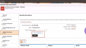
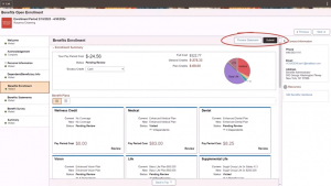
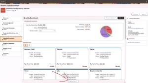
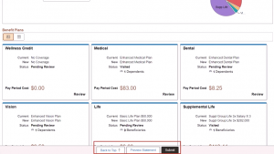
- PeopleSoft HCM PUM 49 | Streamlined Benefits Enrollment Usability Enhancements
- PeopleSoft HCM PUM 48 | Global Payroll & Absence Management | Element Trace Viewer
- Oracle 24A | Redwood Feature Enabled in Goal Creation Page Using AI Assistance
- How AI-Powered Low-Code Platforms Are Transforming Innovation?
- Best 5 Angular Low-Code Platform for Developers In 2025
- How Low-Code/No-Code Modernization Enhances Security and Performance
- How to Build an Enterprise App without Coding?
- What Are the Best Low-Code Platforms for Native App Development?
- Are low-code mobile app platforms only good for prototyping apps?
- Kovaion’s Low-Code Platform: Integrated with Microsoft SharePoint
- Reducing Technical Debt with Low-Code Solutions
- What Kind of Apps do you make using Low-Code/No-Code Tools?
- Best Low-Code Development Platforms for Microsoft SharePoint
- Best way to Develop a Rapid Application Development for Business Needs
- Successfully Transfer Absence Balance a After Global Transfer
- Integrating a Customized Dashboard into Oracle Benefits Self-Service
- Oracle PeopleSoft | Setting Up Alerts for Pending Approvals
- PeopleSoft FSCM 50 | Travel Authorization and Expense Management
- PeopleSoft HCM PUM 49 | Configurable Time Summary to Fluid Timesheet
- 5 Ways Low-Code Application Development Platforms Are Revolutionizing Business
- 10 Low-Code Web App Builders to Simplify Development
- Best FREE Low Code/No Code App Development Platforms
- Top 8 Low-Code Solutions for Building Enterprise Web and Desktop Apps
- Reflecting on Kovaion’s Logo Evolution | Nanda Kumar Speaks
- Top App Builder Platforms for the Education Sector
- 11 Best App Builder Platforms for Hospitality
- How to build applications without coding?
- Best 7 Zero-Code Platforms for Startups
- Top 10 Zero-Code Platforms Transforming Businesses Today
- Best 10 Zero-Code Platforms for Small Business
- Top 8 Zero-Code Platforms for Manufacturing
- What is Zero-Code Platform and Why Should You Care?
- Exploring OpenAI Integration in Low Code Platform
- Why Zero-Code App Development Platform is important?
- Why Your Business Needs Zero-Code Development?
- Understanding Zero-Code Platforms
- Customizing Page Accessibility with Redwood Theme’s Visual Builder
- Exploring PeopleSoft’s Retirement Planning Updates
- Best No-Code Platform for Manufacturing
- The Best No-Code Platform for Banking
- How Does No-Code App Development Builder Work?
- Best 7 Codeless App Builder in Retail
- Best 8 No-Code Mobile App Builders in 2025
- Crafting Engaging Tooltips: Enhancing User Interaction and Understanding
- Best Low-Code Platform for the Retail Industry
- 7 Powerful No-Code Platforms for Business Transformation
- Why Retailers Are Embracing Low-Code Platforms
- Reshape the Retail Future with Low-Code/No-Code
- The Power of Low-Code Platforms in the Retail Industry
- No-Code Form Builders for Small Businesses
- Top 10 Low-Code Platforms to Build Your Next App
- Key Reasons for Pro Developers to Adopt Low-Code
- MyWork Hub at Emids: Intuitive and Unified Platform for Talent & Culture
- Document Management System
- Generative AI vs Traditional AI
- Performance Evaluation Tracking Made Easy in Kovaion’s Low-Code Platform
- Process Automation with a Low-Code Platform | Workflow
- PeopleSoft HCM PUM 48 | Fluid Person Data Edit for Approvers
- Oracle’s Continuous Support & Innovation for PeopleSoft till 2035
- Why Startups Should Start Using Kovaion’s Low-Code Platform?
- Import of Loqate and Non-Loqate Geographies in Oracle HCM Fusion
- Unleash Performance with Redis in Kovaion’s Low-Code Applications
- The Growing Impact of Generative AI on Low-Code/No-Code Development
- What is Rapid Application Development
- Explore Jobs on Oracle Maps with Oracle Recruiting Cloud (ORC) 23D Release
- Oracle Enhances HCM Data Loader- 23C and 23D Updates
- Building a Help Desk Application with Kovaion App Builder
- 10 Ways Low-Code Platforms Can Boost Your Development Workflow
- How Kovaion’s HR Module Streamlines your Recruitment Process
- Geofencing Unleashed: Elevating Time Management in HCM Cloud Web Clocks
- The Evolution of Signature | Modernizing HR Practices | Oracle HCM Cloud
- Understanding Low-Code No-Code (LCNC) Platforms
- Comprehensive Guide to No Code Development
- Security Migrations Made Easy using Oracle HCM Cloud
- Top 8 Low-code Platform for Healthcare
- Best Low-Code/No-Code Platforms Every Developer Should Know
- 7 Best No-Code Development Platforms for Small Businesses
- Oracle 23D | Redwood Experience for Compensatory Plan Adjustments
- Best 10 No Code Platforms in SaaS
- Best Low-Code Platforms for Small Business in 2025
- Best Low-Code Platforms in SaaS
- Oracle BI Reports | Incorporating Barcodes via RTF & Administration Setup
- Enhancing Managerial Oversight with Strategic Absence Planning
- PeopleSoft HCM PUM 47 | Personal Data Modernization
- PeopleSoft HCM PUM 47 | Time and Labor Component Lockdown
- Enhancing Low-Code Forms with Third-Party API Integration
- Enhancing Wellness in Oracle HCM through Smart Watch Integration
- How to Secure eEnterprise Mobile Apps
- Magic Quadrant for Enterprise Low-code Application Platforms 2025
- Low-Code Development Platform Software with Data Mapping
- Best 5 No-Code Development Platforms in 2025
- Best 8 No-Code Development Platforms for Enterprise Businesses
- Best 9 Low-code Platforms for Startups
- Top 8 Low-code Development Platforms on a Budget to Use in 2025
- Best 7 Low-Code Dashboard Builders in 2025
- 7 Best Low-Code Mobile App Development Platforms in 2025
- Top 7 Low Code Platforms for Enterprises
- Top 7 Low-code Platforms for Banking
- Oracle ERP Cloud | Multiperiod Accounting Invoices
- PeopleSoft | PeopleTools 8.61 Key Highlights
- Triggering Notifications | Mass Allocation of Journeys via Rest API
- Future of Low-Code/No-Code App Development Platforms
- Project Cost Management: The Art of Budgeting and Expense Control
- Low-Code Platform for Automating Business Processes in the Manufacturing Industry
- Top 5 Low-Code Test Automation Tools in 2025
- The Top 7 Industries that Can Benefit from Using a Generative AI App Builder
- Generative AI vs. LLMs: What’s the Difference?
- Top 5 Zoho Creators Alternatives
- Top 7 Use Cases of Low-Code Automation Across Industries
- 5 Popular Rapid Application Development Tools in 2025
- Top 8 Best Generative AI App Builders 2025
- What is LLM and How does it Work?
- How to Build an App using Generative AI App Builder
- Revolutionizing Retail and Wholesale: Unleashing the Power of Low-Code Automation
- Citizen Developers vs. Professional Developers | The Difference
- How Low-Code Solutions Can Reduce Costs in Healthcare
- Best No-Code App Builders in 2025
- The 7 Best App Building Software for Small Businesses
- Streamlining Retail and Wholesale Operations with Low-Code Automation
- Benefits of Low Code in Manufacturing
- 9 Best Mobile App Development Tools & Software
- 4 Use Cases of Low-Code in Healthcare
- Creation of Contracts in Oracle Cloud ERP
- Comprehensive Guide to Low Code Development | All you need to know
- When Your Company Needs to Invest in Low-Code Automation?
- Low-Code/No-Code Examples & Use-Cases
- 10 Best Low-Code Development Platforms to Use in 2025
- Time and Labor and Absence Management Integration
- Oracle HCM Cloud – Expense Restricting Rate Limits in Expense
- No-Code Vs. Low-Code Vs. High Code Vs. Zero Code | Difference
- Streamlining Managerial Tasks with PeopleSoft HCM’s Direct Reports Tile
- Oracle ERP Cloud Evaluated Receipt Settlements (ERS)
- Oracle ERP Cloud Touchless Buying
- Revamped Learning Page Experience for Learners & Managers | Oracle Learn
- Leveraging Python & Oracle Functions for Serverless Excellence
- 7 Must-Have Dashboard Features for Business
- Oracle CloudWorld 2023: Discover the Latest News
- Enhancing HR Management with Power BI: A Comprehensive Analytics Report
- Revolutionizing Recruitment with AI-Powered Resume Matching Chatbot
- Navigating Data Mapping in Oracle Integration Cloud
- PeopleTools 8.59 | NavBar Menu Sorting
- Updated Workflow Transaction with Workflow Rules Report
- Peoplesoft HCM PUM Image 46 | Employee Header Configuration
- PeopleTools 8.59 and 8.60 | Process Monitor Changes
- Transaction Reversal in PeopleSoft Asset Management – Capability to Reverse Incorrect Transactions
- Fluid Compensation History – A revolutionary change in ESS | PeopleSoft
- PeopleSoft Process Flow Basics
- Self-Service Address Configuration Page | PeopleSoft
- Related Content Service Framework | PeopleSoft
- Generating Custom XMLP Reports in PeopleSoft with Desired File Names
- Oracle BI-Extract Employee Photo using Dynamic Blob
- Enhanced Payables Management with Business Unit Management | PeopleSoft FSCM PUM 46
- Generating Employment Agreement Letter Through the Checklist
- Enhanced Data Lockdown Framework | PeopleSoft HCM PUM 46
- Exploring Oracle Grow in Oracle ME
- Implementing Compensatory Type Absence
- Empower your Workforce with Effortless Learning Through Auto-Enrolment
- Kovaion has been recognized by Oracle as a “PeopleSoft Partner”
- Enabling Metrics in Requisition Overview | Oracle Fusion Recruiting Cloud
- PeopleSoft HCM Update Image 46 | PUM Highlights
- PeopleSoft HCM PI45 Absence Management through Self Service
- 5 Powerful Form Builder Features of Kovaion’s Low Code Platform
- Best Practices of UI/UX Creation for Startups
- Harnessing the Potential of the Placement Dashboard | From Campus to Career
- Creation of Manual Transaction and Billing Adjustments
- Generation of Letter from Document of Records When using HDL
- PeopleSoft HCM Update Image 45 | Additional Display Configurability for Company Directory
- Oracle Fusion HCM 23A | Push Reminders Made Easier with Oracle Nudge
- Oracle’s Extended Support for PeopleSoft to 2034
- Oracle ME | Guides, Connects, Support Employees
- PeopleSoft HCM Update Image 45 | Display Remote Worker Vaccination Visualization
- Employee Self Service – Flexible Schedule Change | PeopleSoft HCM PUM Image 44
- PeopleSoft HCM | Personalize My Team for Manager
- Test Data Generation Tool
- 10 Signs your Business Needs a Low Code Development Platform
- Oracle Cloud 22D Release Updates – Oracle Recruiting Cloud (ORC)
- Elevate Employee Experience Using Journeys | Oracle ME
- PeopleSoft FSCM Update Image 45 | Manage Receipts
- Back-to-Back Wins of PeopleSoft Innovator Award 2022 & 2023
- PeopleSoft Innovator 2023: Karnataka Bank & Kovaion
- PeopleSoft PUM Image 45 | Performance Management for Mobile Users
- Deep Dive into PeopleSoft Questionnaire Framework
- Dynamic Tile in PeopleSoft
- WhatsApp Promotional Messages | WhatsApp Marketing Messages Examples
- Oracle HCM Cloud Implementation | Absence Setup Migration
- Creation of BIP Report | Leveraging Excel Adapters | Oracle Fusion
- Billing Process of Projects with Contracts | Oracle ERP Cloud
- Automated Calendar Group Creation – PeopleSoft HCM PUM 33 Feature
- Revolutionize your Business with Mobile Responsive Evaluation Management Questionnaires
- PeopleSoft HR Notification | Announcements Made Easy
- Compute Salary components with system-driven metrics
- Operational excellence with intuitive PT 8.58 Kibana Analytics & Rapid Cloud Deployments
- Seamless Document Processing with E-Signature using Oracle HCM cloud checklist tasks
- PeopleSoft HCM PUM Image 34 | Feature Highlights & Enhancements
- PeopleSoft Test Framework (PTF) as part of PeopleTools 8.58 | New Features Overview
- Free Implementation of Workforce Health and Safety in Oracle HCM Cloud
- Onpremise PeopleTools 8.58.03 Available for Download
- Dig Deeper into Fluid Extended Absence Self Service | Oracle PeopleSoft PUM 31 feature
- PeopleSoft HCM PUM 33 | Features &Enhancements | Staying Current with PeopleSoft Updates
- What’s excitingly new in PeopleTools 8.58? – A sneak peek into PeopleTools 8.58 Highlights
- Fluid HCM Company Directory | Features & Usability improvements
- Kovaion Consulting | Corporate Profile
- Kovaion global contribution towards customer adoption by focusing on Oracle Star products
- Dynamic impact of Internet of Things (IoT) in HR
- Accelerate your interview process with Evaluation Management & Microsoft Office 365
- BI Schedule Trigger–Dynamic Job Scheduling
- Incorporate your Business with Oracle Blockchain Cloud Services
- Optimizing Evaluation Process in Taleo | Kovaion
- Artificial Intelligence in HR processes recuperating
- Enhancing recruitment & learning experience using Oracle & LinkedIn collaboration
- Enhance & Upgrade the robust Oracle HCM Cloud with R13
- My Experience with #Sangam17
- SQL Update on PSURLDEFN, Application Server and GetURL(URL.XXXX) – All connected
- Oracle OpenWorld 2014
- PeopleSoft Health and Safety – Enhancement & Modernization
- Automated Generation of Employee Letter from Document of Records
- Leverage “Fluid Discussion Service” for effectual cross team
- A decade of IT Services: Kovaion Celebrates its 10th Anniversary
- Modern & Fluid Job Data Page on PeopleSoft HCM PUM 36
- Kibana Analytics on PeopleSoft General Ledger – PeopleSoft FSCM Image 37
- A smart way to act on Performance pending notifications
- Payroll processing for “Leave of Absence” – PeopleSoft PUM 33
- Oracle HCM – Validate User inputs on-the-go using Groovy Expressions
- Handling Talent Evaluation in Global transfer with Oracle HCM Cloud
- HR Business Partner Feature – PeopleSoft HCM PUM 31
- Unified Sandbox – A Simplified approach for Customization
- Autocomplete Rules – A New tool in HCM Experience Design Studio
- Dwell Deep into Drop Zones | Extension to Classic Foundation Pages
- Audit password changes using Oracle HCM Cloud scheduled process
- PeopleSoft HCM PUM 35 Feature Highlights | Kovaion
- Avoid Customization – Mask Sensitive Data just by Configuration
- Communicate Effectively With Your Employees | Kovaion
- Accelerate PSFT HCM Transformation by managing your Customizations
- Deep Dive into SQL Query Logs to Improve BI Performance
- PeopleSoft Fluid Announcement Tile | Kovaion
- PeopleTools 8.58: Isolate Customizations to AppEngine programs via Plug-ins
- Embark Your Security Journey with Location Based Access
- Build intuitive visualizations using PeopleSoft Kibana
- Creating Job Requisition in Few Clicks-Oracle 22A update
- Auto provision Area of Responsibilities (AOR) in HCM Cloud
- One Click Solution to Handle Mass DOR Downloads In HCM Cloud
- Employee Calendar makes tasks easy – PeopleSoft HCM 42 feature
- Leverage Absence Management to handle ESS Reimbursements
- Systematize reiterating time off with the help of Oracle HCM Cloud
- Green IT – The Future Ray of Hope for Globalization Sustenance
- Remote Worker | PeopleSoft HCM Image 40
- Kovaion Day – Embarking on the 12th year
- HCM PUM 39 Kibana Analytics Overview of Payroll Costs
- HCM PUM 38 gives a nicer way to synchronize Job Skills to your Talent Profile
- Connections – A New User Experience for Directory
- PeopleSoft Intelligent Chat Assistant from Oracle (PICASO)
- Embarking on Journeys with HCM Cloud Checklists
- Peopletool 8.59 Overview
- Password verification – Leverage users to access checklist in secured way
- PeopleSoft Global Search – Step Wise Configuration
- PUM 37 Enhancement – More on Page and Field Configurator
- Dwell Deep into Drop Zones – PeopleSoft PUM 34 Feature
- Oracle HCM Survey – To align People and Business strategy
- PeopleSoft HCM PUM 43 Feature | Quick Calculation for NA payroll
- Create Minimal Career Template | Prior 23B Update
- 5 Ways to Engage Your Employees | WhatsApp Business App
- Sensitive Data Access Audit | Oracle HCM Cloud | 21B Release
- Oracle Learn – Leaderboard | All You Need to Know
- Oracle Digital Assistant | What it offers for HCM Cloud Customers
- PeopleTools 8.59 | Exploring Search & Navigation Features
- PeopleSoft PUM 43 | Absence Balance & Forecast Feature Enhancement
- Approvals on the Go
- PeopleSoft Event Mapping Framework
- PeopleSoft | Fluid Dashboards
- PeopleTools 8.56 – Classic Plus
- PeopleTools 8.55 – Navigation Collection and Tile Wizard
- PeopleSoft-Smart HR Templates
- Creating Linked Servers in SQL Server 2012 to SQLServer 2000
- Onboarding in Taleo Business Enterprise | Hiring New Employees
- Kovaion Had a Great Show #Sangam15
- Fusion HCM Data Loader | Seamless On-Premise to Cloud Transition
- Cloud Talent Management Solution | Oracle Taleo Business Edition (TBE)
- Integrated Recruiting Reports in Taleo | Analytics Made Easy
- Career Section in Taleo Business Enterprise-Smart Career Site Manager
- PeopleSoft Approval Framework | Line Level Approval
- Peoplesoft | Drill Down PS Query
- PeopleSoft Composite Query
- PeopleSoft Fluid User Interface
- SQL Update on PSURLDEFN, App Server & GetURL(URL.XXXX) – All connected
- Peoplesoft Outlook Integration
- Peoplesoft Paycheck Modeler
- PeopleSoft Interwindow Communication
- UKOUG EMEA PeopleSoft Roadshow 2013 | Event Article
- Cumulative Feature Overviews (CFO) For PeopleSoft 9.2
- Understanding Automatic Enrolment
- HMRC RTI – Oracle PeopleSoft | Kovaion
- PeopleSoft Test Framework
- All you Need to Know About Data Archival | Kovaion

